Summary
Muse is an app concept to combine multiple music services such as SoundCloud and Spotify into one single application. I designed, sketched, and mocked–up Muse using Sketch and Marvel. Click here to view the final design with interactions.
Role ― UI/UX Designer
I did market research on two products – SoundCloud and Spotify. Then I decided on the most pertinent features. I sketched the new app on paper, before moving the designs into Sketch. Finally I added interactions to my mocks using Marvel.
Challenge
Switching between music apps is not a pleasant user experience. In the worst case, you have to stop playing music on one app, go to the home screen, open the other music app, and play your next song. For someone who listens to a lot of music from many different sources such as Spotify, SoundCloud, Apple Music, YouTube, Google Play etc. that can be quite frustrating. One of my friends who is a huge music listener, put it simply,
"I just hate switching between my SoundCloud and Spotify Libraries."
Final Design (Click it!)
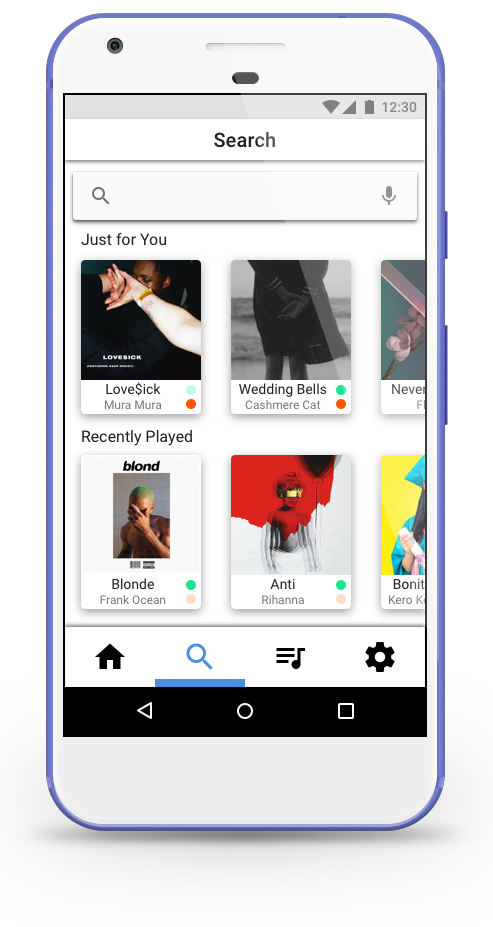
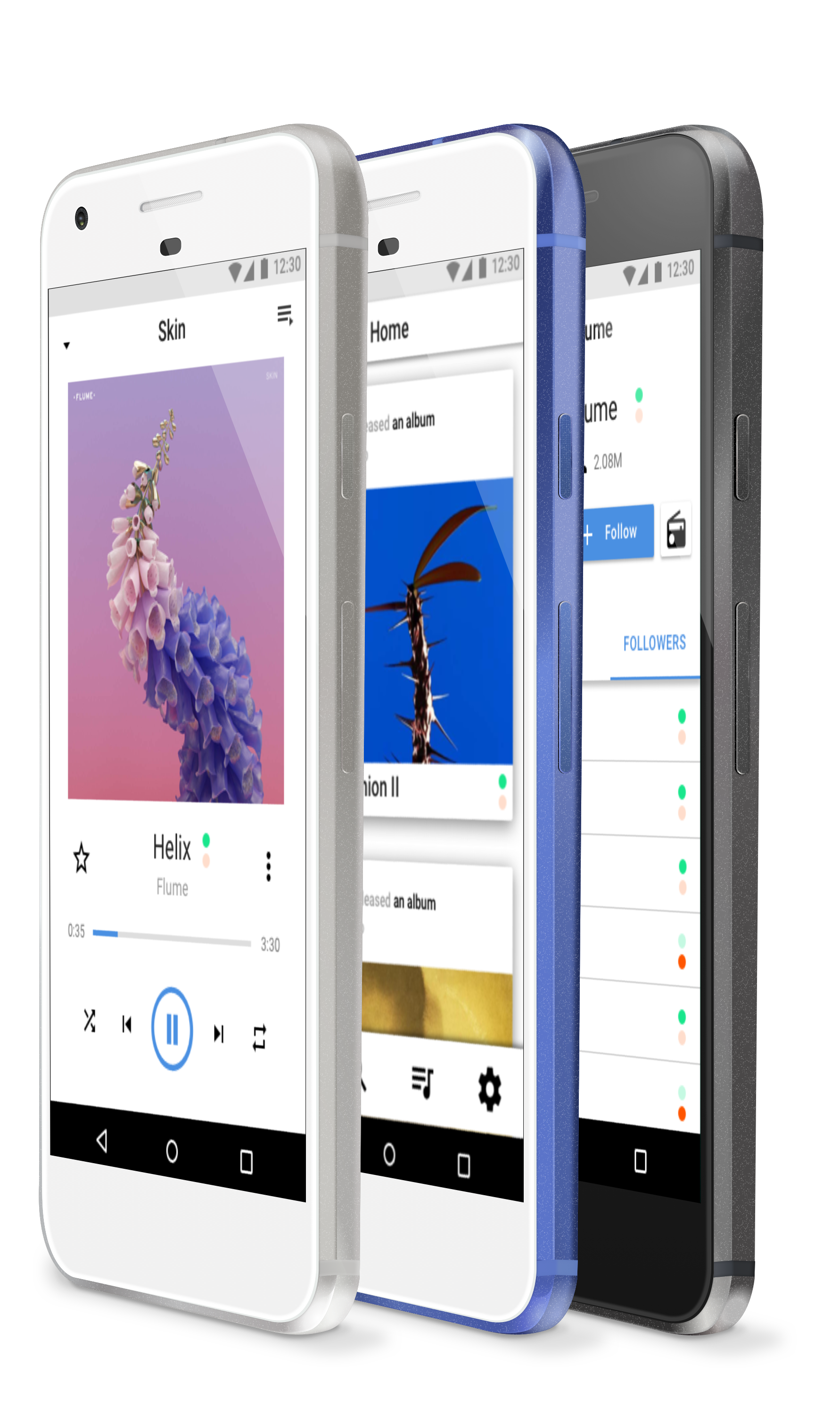
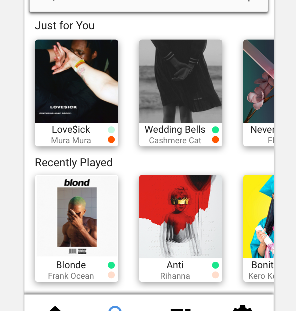
Muse was made for SoundCloud and Spotify on Android, but work just the same on iOS. The four major views are Home, Search, Your Library, and Settings. The navigation was kept on the bottom so it was easy to reach for users. The app used many Material Design elements and cues. My overall goal was to keep the app simple and clean to the basic and minimal features as well as incorporating clear visuals of what was source of the piece of music – signified by different colored circles. Go ahead and please try the prototype.
The Home view contained new releases by artists – analogous to the SoundCloud homepage. The Search view includes suggestions for you as well as your recently played songs. Your Library has pretty typical features such as Playlists, Songs, Albums, etc. The Settings view is basic, just having log-in buttons for SoundCloud and Spotify.
Final design mockup (Please click it)
UI/UX Design Overview
My design process was to consolidate the system models (and resulting conceptual models) for two major music applications – SoundCloud and Spotify. Other combinations such as Apple Music and SoundCloud could have been chosen, but I personally use SoundCloud and Spotify and this is as common use case as well.
After picking the essential features, I then sketched out my design for Muse on paper to understand how the user flow worked. From there I began to mockup my designs in Sketch. I uploaded the Sketch artboards to Marvel and made the final prototype of Muse.
Essential Features
I opened both apps on my phone and began to take numerous screenshots of both apps. I wrote down the corresponding features for each app. To decide what would go into my new app, I judged on what I thought was essential to the user experience – nothing extra. So nothing like "Jump Back In," "Happy Sunday!" (a playlist suggested by Spotify), "Podcasts & Videos," etc. My sketches of my redesign are to the right below.
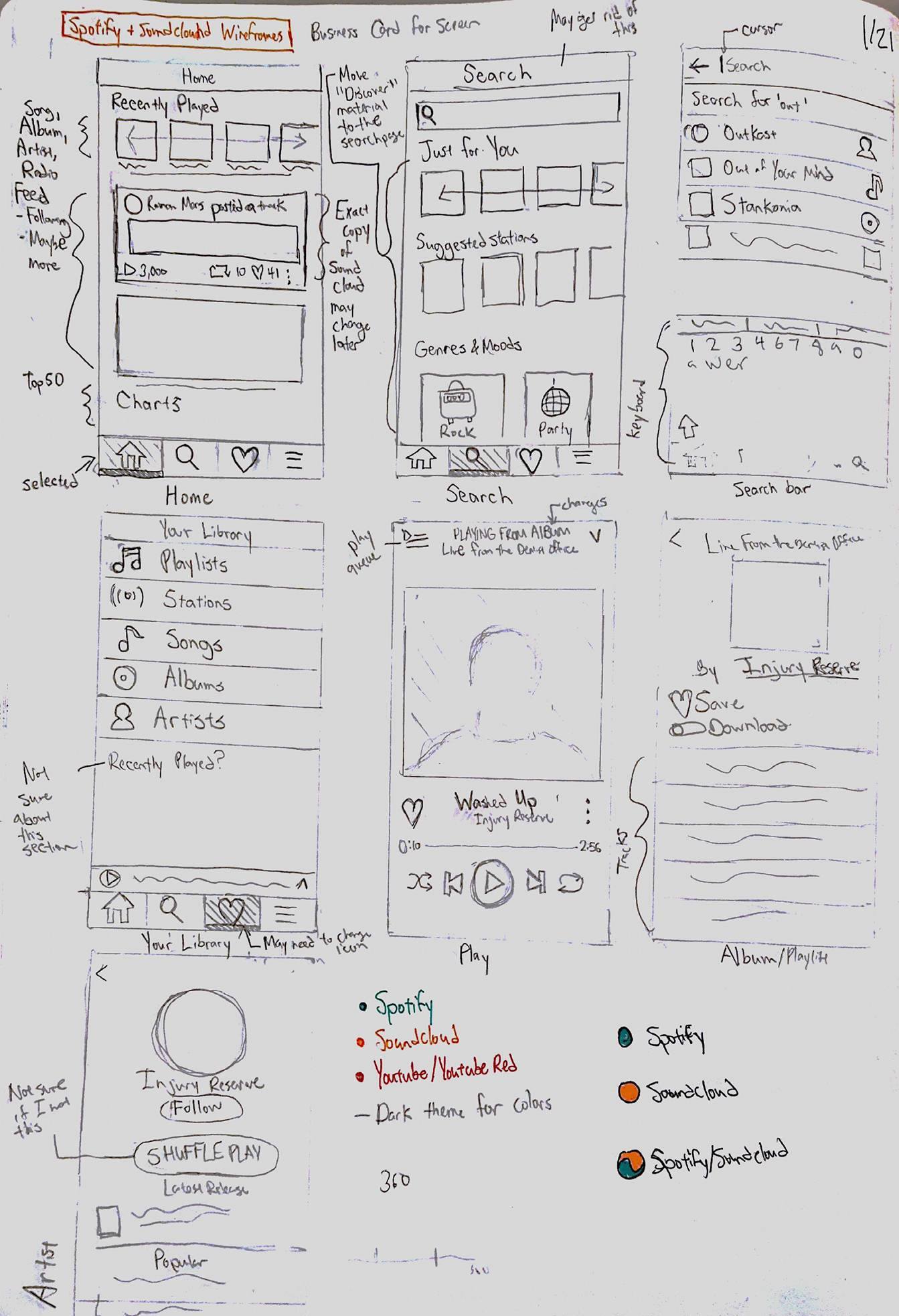
Initial Sketches
Differentiating Apps
The most important feature of my app was how to differentiate between the origin of your music service. Otherwise I would have just made a redesign of a music application. I thought through a few designs, but I thought the simplest design was two (or more circles) that were filled if the music was from a particular source and translucent if not (orange for SoundCloud and green for Spotify). I called these stickers.
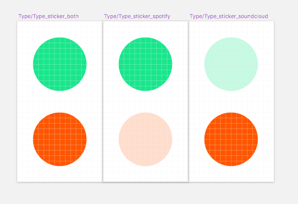
Stickers
Stickers in Context
High Fidelity Mockups in Sketch
A few of my mockups from Sketch – please take a look. The Google Pixel assets were made by Hanii and Victor Stuber.
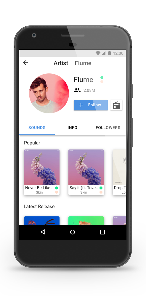
Artist Page
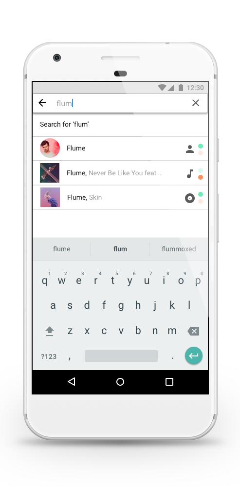
Searching Page
A video demonstrating user representative tasks. Feel free to try these in the prototype above.
Next Steps
Currently, this application has not been implemented as the music services are separate companies. This work is relevant to simplifying a music app down to its core features based on the system models of both SoundCloud and Spotify. I would like to also do some more usability testing on my design.